
Share Space
A self-serve app so REC Philly's 1,000+ members can book studios without calling the front desk.
Overview
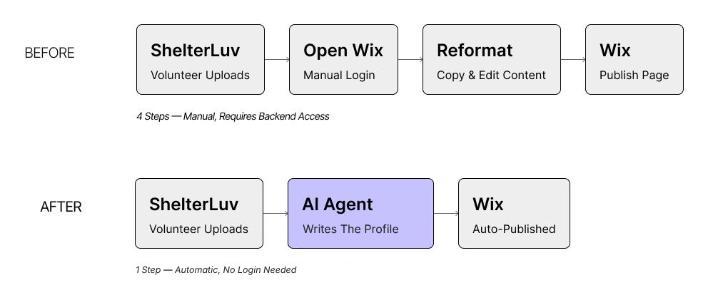
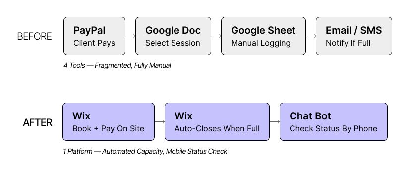
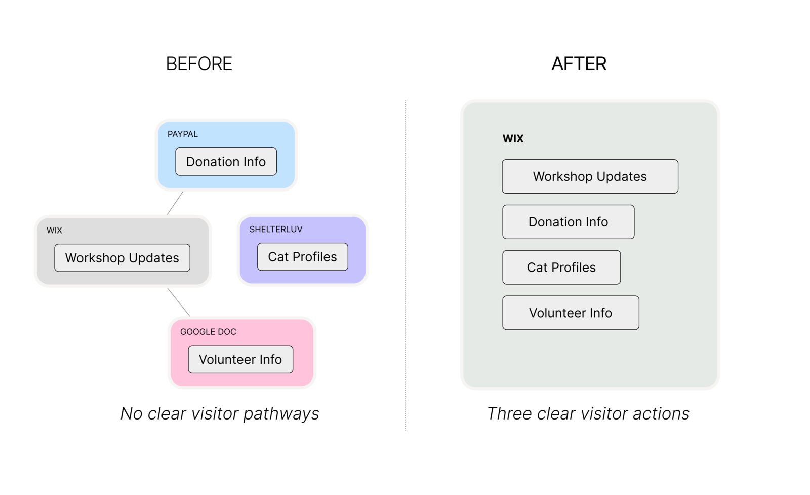
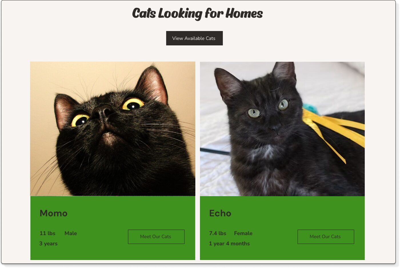
REC Philly is a creative coworking hub in Philadelphia. Studio bookings were handled by phone through a single front-desk coordinator, which caused overbooking, long waits and missed chances for creators to connect.
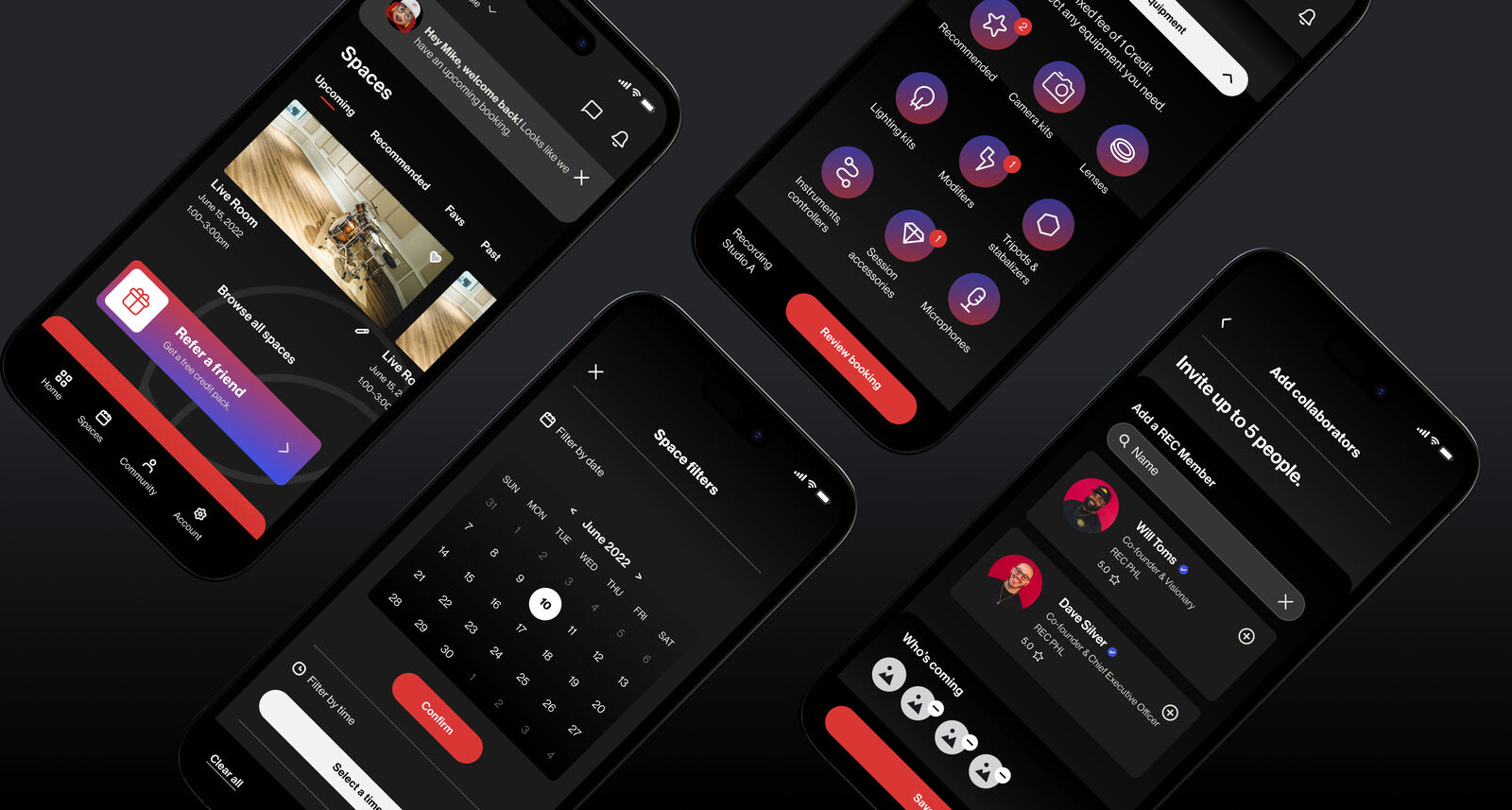
I designed the UX for a mobile app where members book rooms, pay and connect with other creatives. I worked within a brief the project lead had already defined, so requirements and scope were set before I joined. The information architecture, flows, wireframes, design system and high-fidelity prototype were mine.
Problem
REC Philly runs on memberships and room bookings, so bookings are revenue. The phone system created three problems that fed each other:
- Revenue leak. Rooms sat empty because members couldn't see or claim availability.
- Scaling ceiling. One coordinator set the limit on how many bookings the space could take.
- Churn risk. Double bookings and long waits wore down the trust members needed to renew.
Before: phone booking
- Call the front desk to check availability
- One coordinator handles every request
- Double bookings and no-shows
- No way to see what's free
- No way for members to connect
After: self-serve app
- Browse and book any time
- Real-time availability for every room
- Payment in the app
- Member profiles and discovery
- Job board and direct messages
Information architecture
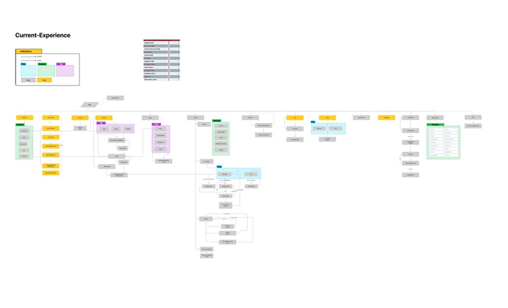
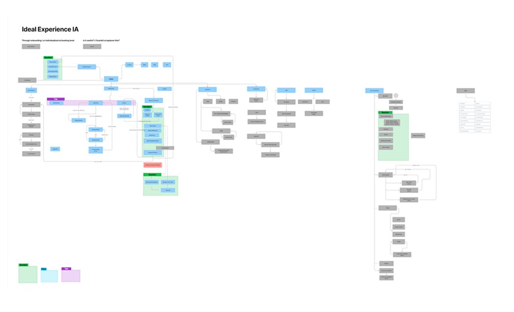
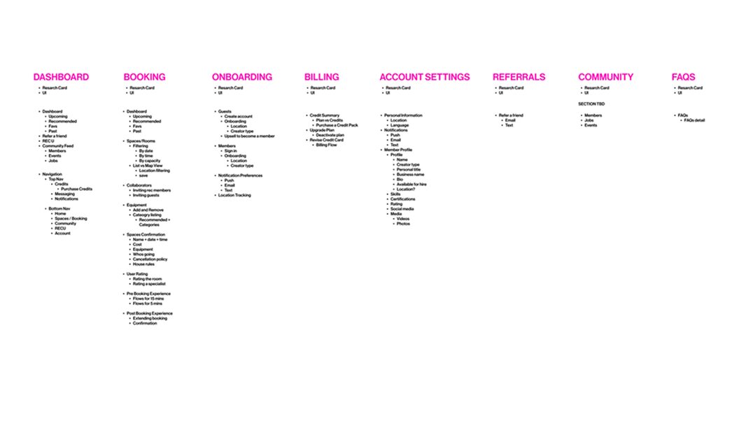
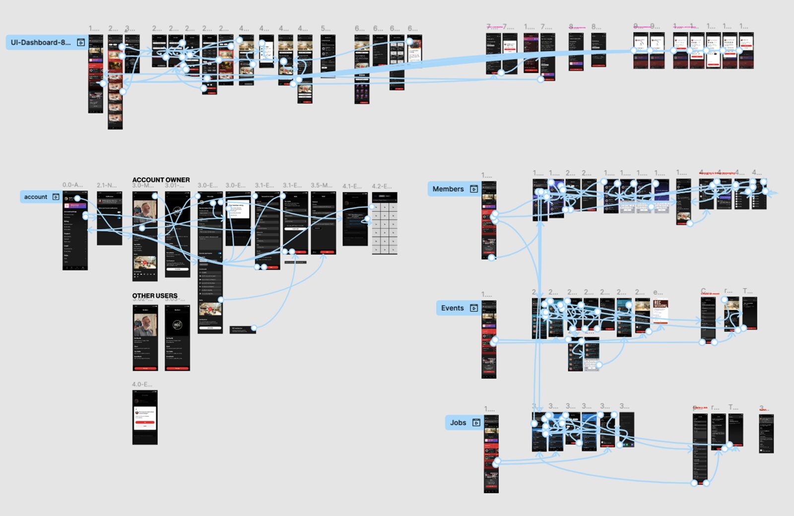
I mapped the current and ideal experience to find the gaps, then prioritized the user stories with the team before any design began.
User flows
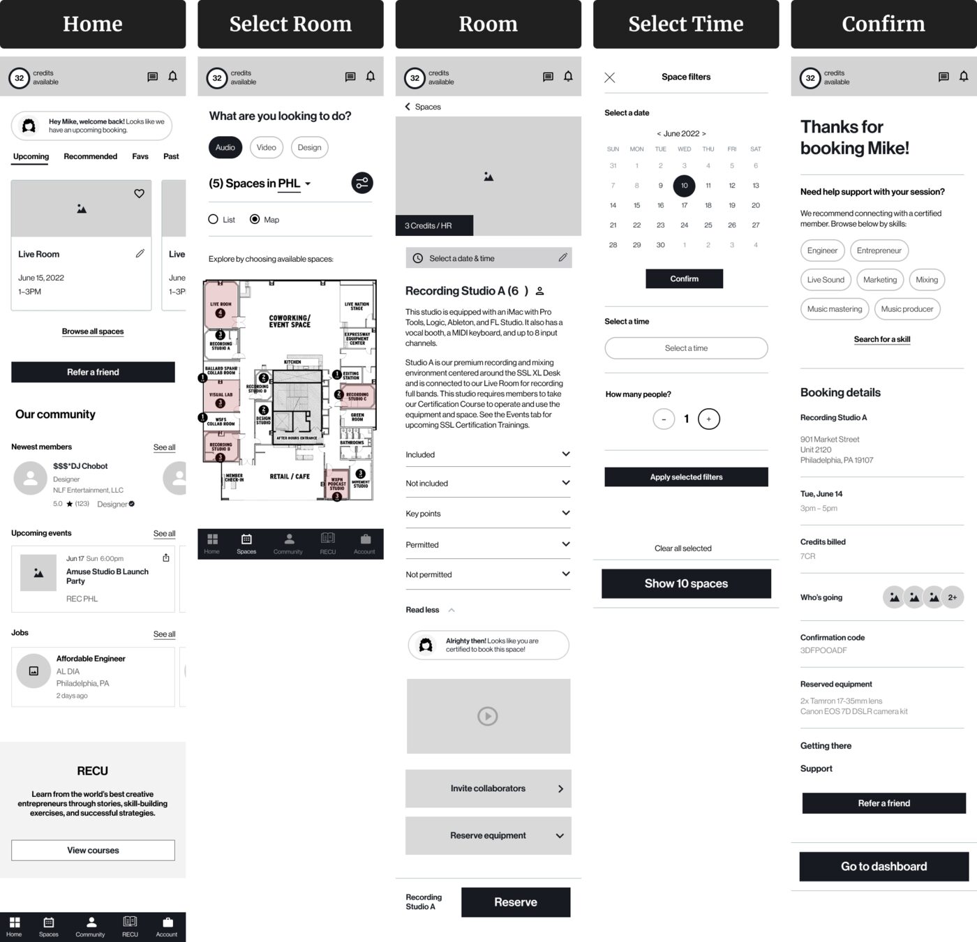
I designed the three flows members needed most, keeping each to a few steps.
Wireframes
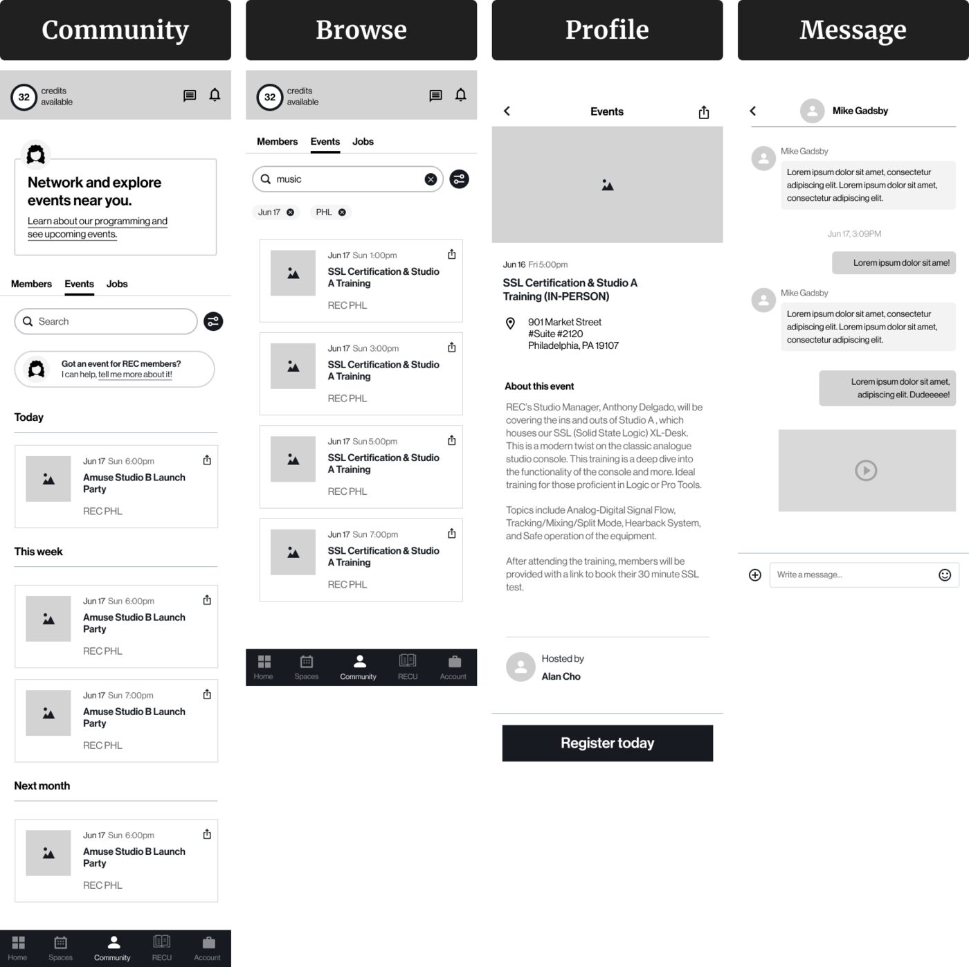
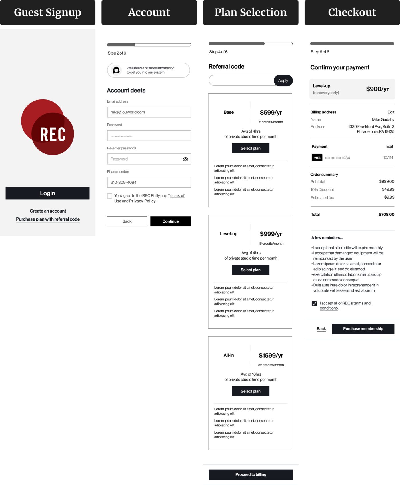
I wireframed layout, content and flow logic first so I could test ideas with the team before polishing the UI.
Visual design
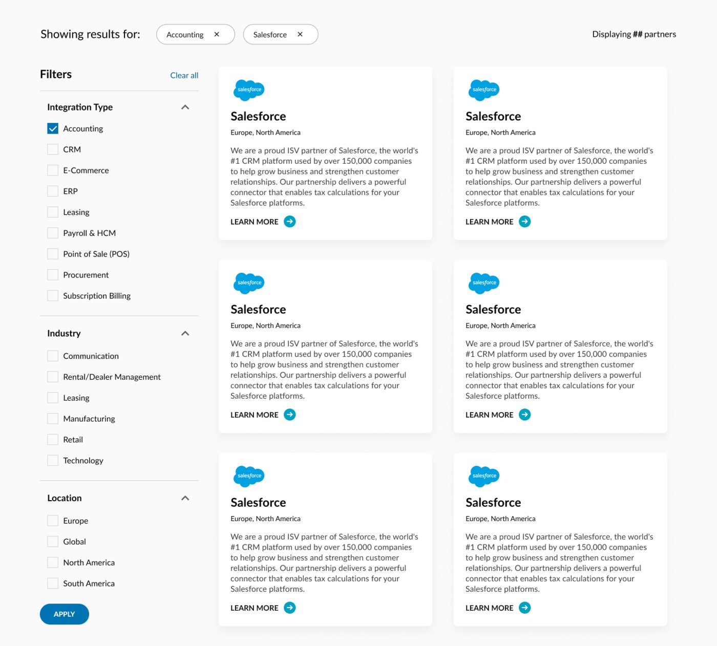
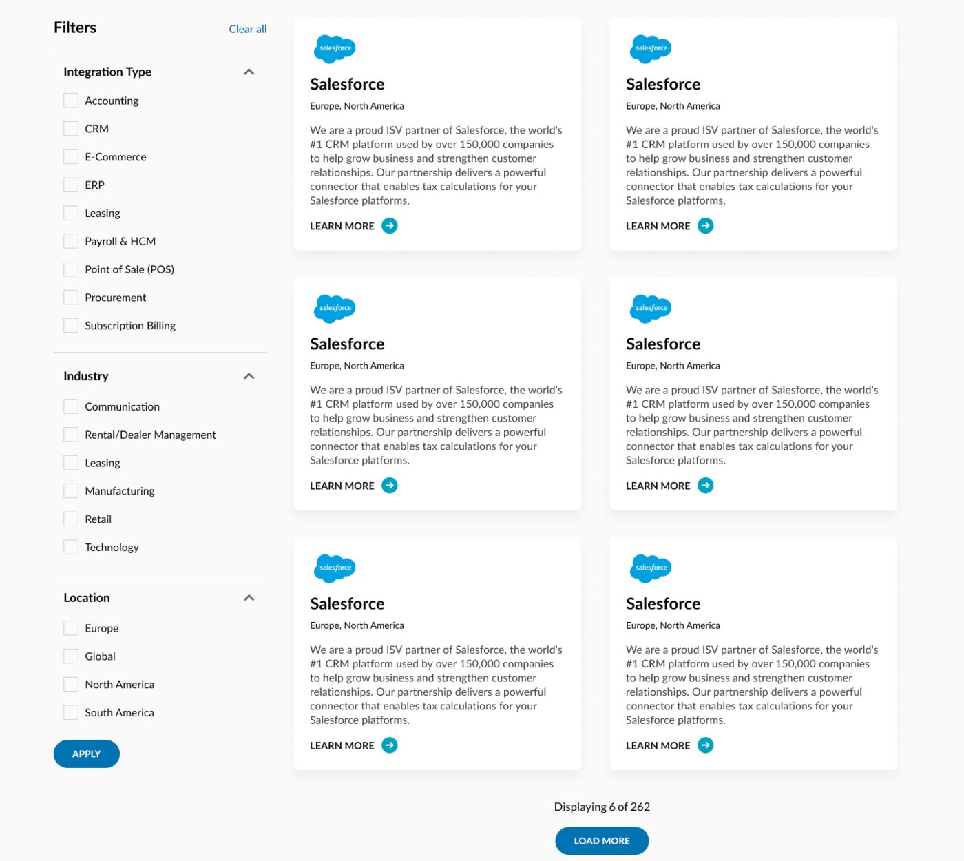
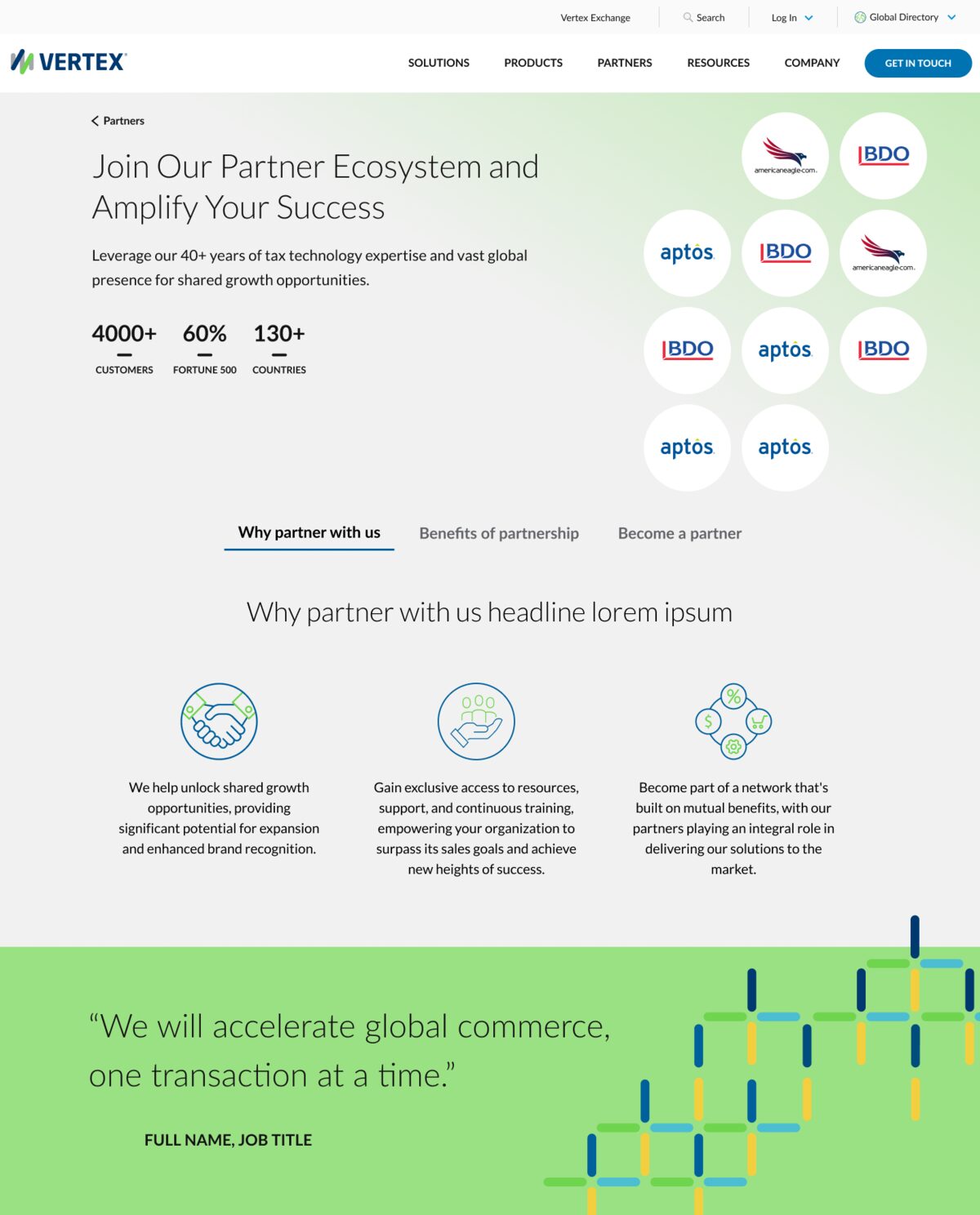
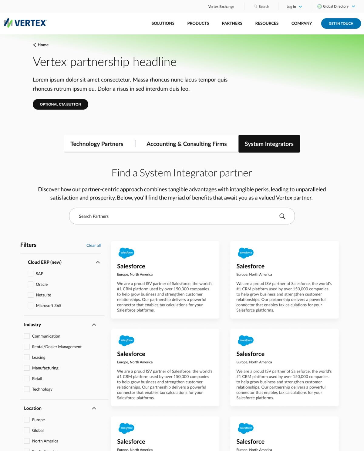
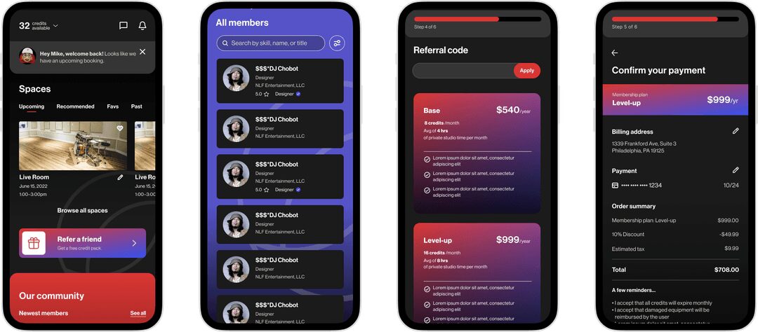
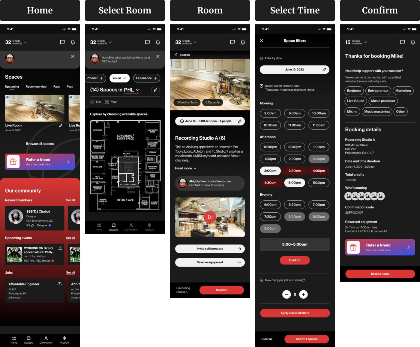
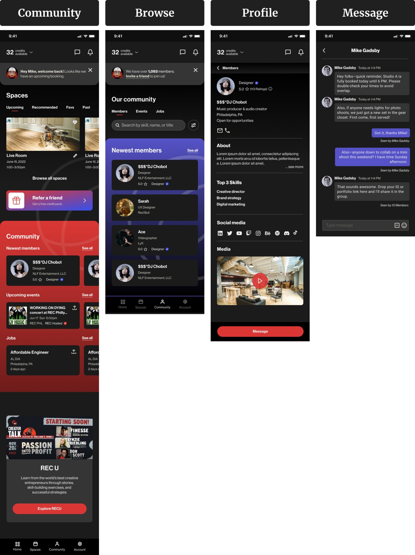
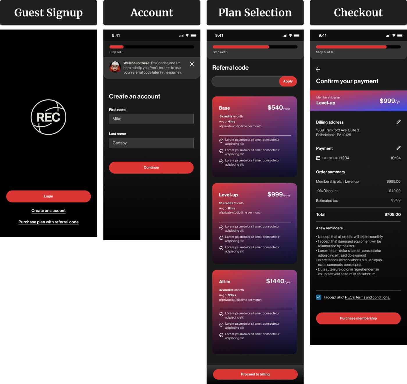
The final UI carries REC's bold creative energy, kept simple on the high-traffic booking and membership screens.
Testing
I tested the prototype on site with Scarlett, who handled every booking by hand.
Rather than rely on remote feedback, I went to REC and walked through the prototype with her, watching where it fit her day and where it caused friction. That session changed two things a survey would have missed:
- She spotted unclear time slots straight away, so I made them easier to read.
- Her warm, helpful style became the "Scarlett" chatbot, so the app kept the tone members knew from the front desk.
Outcome
Members can check availability, book and pay without anyone at the front desk.
The design removes the single-coordinator bottleneck. REC Philly's team reviewed and accepted the designs, and they were handed off for development.
I don't have data on how it performed after handoff. If I could measure it, I'd look at how many bookings happen without the front desk, how often rooms are double-booked, and how many empty hours get filled.
What I learned
- Client meetings work best with a clear agenda and agreed goals.
- Visiting the space showed the real rhythm of bookings in a way remote feedback couldn't.
- One person's way of working can shape a feature. Scarlett's warmth became the chatbot.