Share Space
Mobile App for Creators
REC Philly is a creative coworking hub in Philadelphia with over 1,000 members. Previously, all studio bookings were handled manually through a single front desk coordinator, causing overbooking, long wait times, and missed opportunities for creators to connect.
I designed the UX for a mobile app that lets members book rooms, make payments, and connect with other creatives — replacing a manual process that funneled every request through a single coordinator.
Working within a brief defined by the project lead, I owned the UX design end-to-end. My contribution covered information architecture, all wireframes and user flows, the design system, and high-fidelity prototypes. Product requirements and project scope were set before I joined; the structural and interaction design was mine to define.
Problem
REC Philly runs on a membership and room booking model — bookings are revenue. The phone-based system created three compounding business problems:
- Revenue leak: rooms sat empty because members couldn't easily discover or claim availability
- Scaling ceiling: with one coordinator handling all requests, the booking capacity couldn't grow with membership
- Churn risk: double-bookings and long wait times eroded the trust members needed to keep renewing
The design goal wasn't just to make booking easier — it was to remove the operational constraint capping how many bookings the space could handle, and to close the gap between available inventory and realized revenue.
REC Philly managed room bookings through phone calls with one front desk coordinator. This led to several issues:
- Members couldn't see room availability
- Double bookings and long wait times were common
- Some rooms were overused while others sat empty
- There was no way for members to connect, share gigs, or find collaborators
Phone-based booking
- Call the front desk to check availability
- One coordinator managing all requests manually
- Double bookings and no-shows were common
- No way to see what spaces were free
- Members had no way to connect with each other
Self-serve mobile app
- Browse and book spaces anytime, in-app
- Real-time availability across all rooms
- Payments handled directly through the app
- Member profiles and community discovery
- Job board and direct messaging between creatives
Solution
I designed a self-serve mobile app for REC members, replacing the phone-based process and adding key community features.
- Book and cancel rooms anytime
- Pay for reservations directly through the app
- Build profiles and connect with other creatives
- Find or post job opportunities in the community
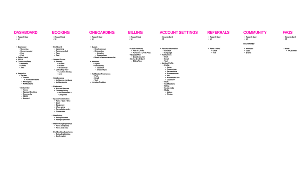
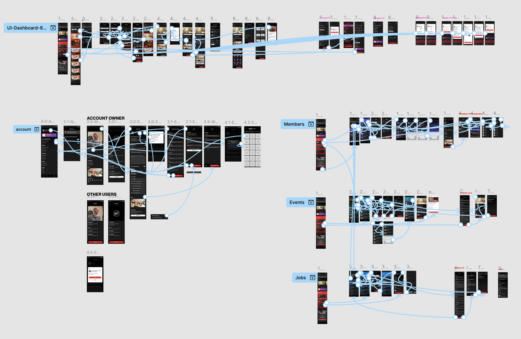
Information Architecture
I mapped the current and ideal user experience to identify gaps and streamline the structure. This became the foundation for the app's navigation and core feature set.
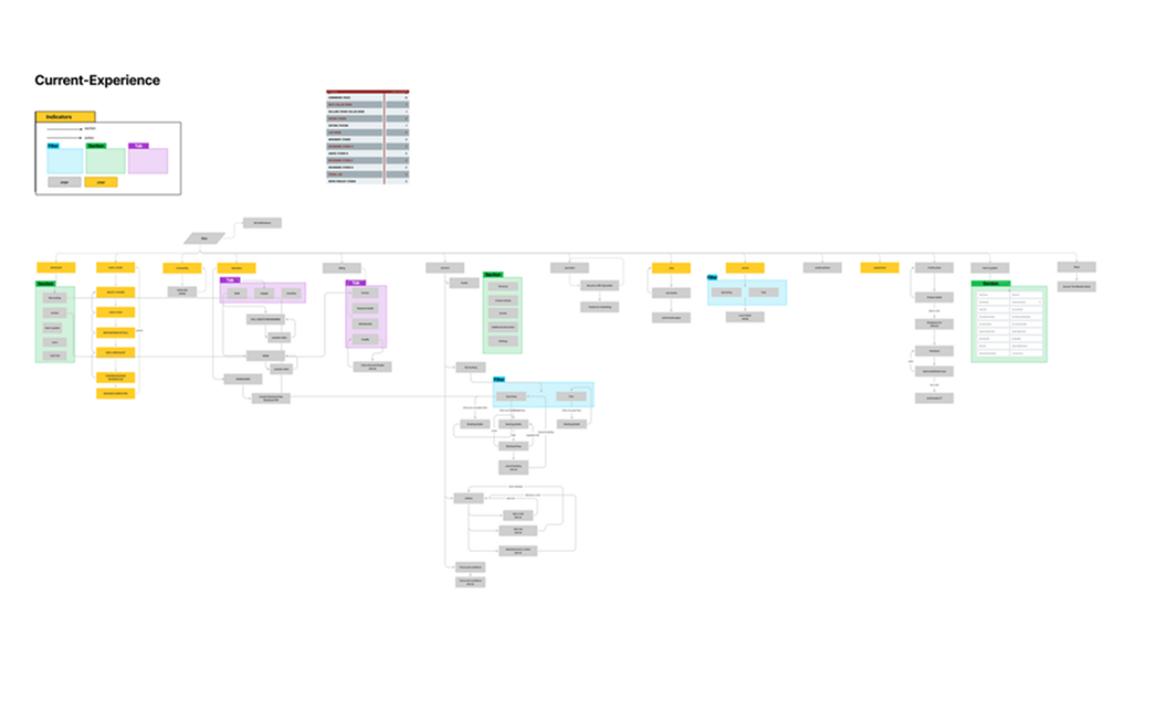
The redesigned structure gives members a clear path to book, pay, and connect — with fewer steps and no front desk dependency.
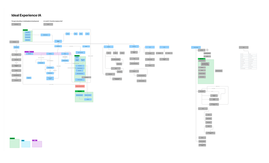
A prioritized feature map of all core user stories, used to align the team on scope before design began.
User Flows
I designed clear, intuitive user flows for the core actions members needed most: booking a room, joining the community, and purchasing a membership. Each flow focused on reducing friction and helping users reach their goal in just a few steps.
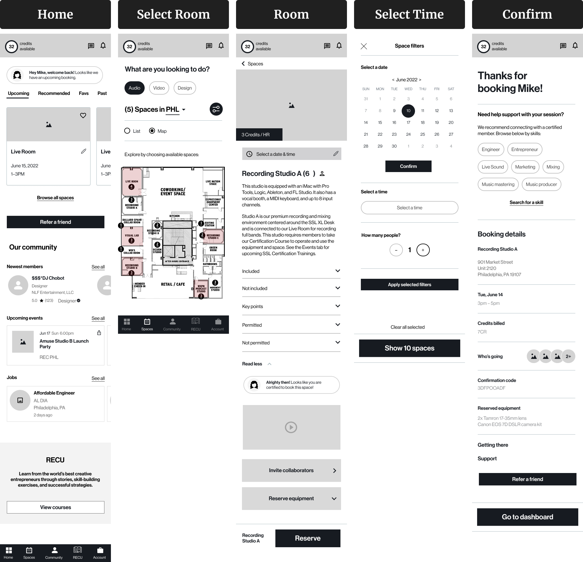
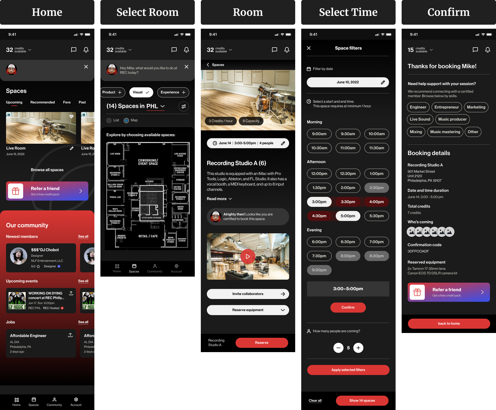
This was the most frequent task for members, so I focused on speed and clarity. The goal was to let users quickly see available spaces, apply filters, and confirm their booking with minimal effort.
- Choose space by type, size, or capacity
- View real-time availability
- Select date and time
- Confirm and pay in-app
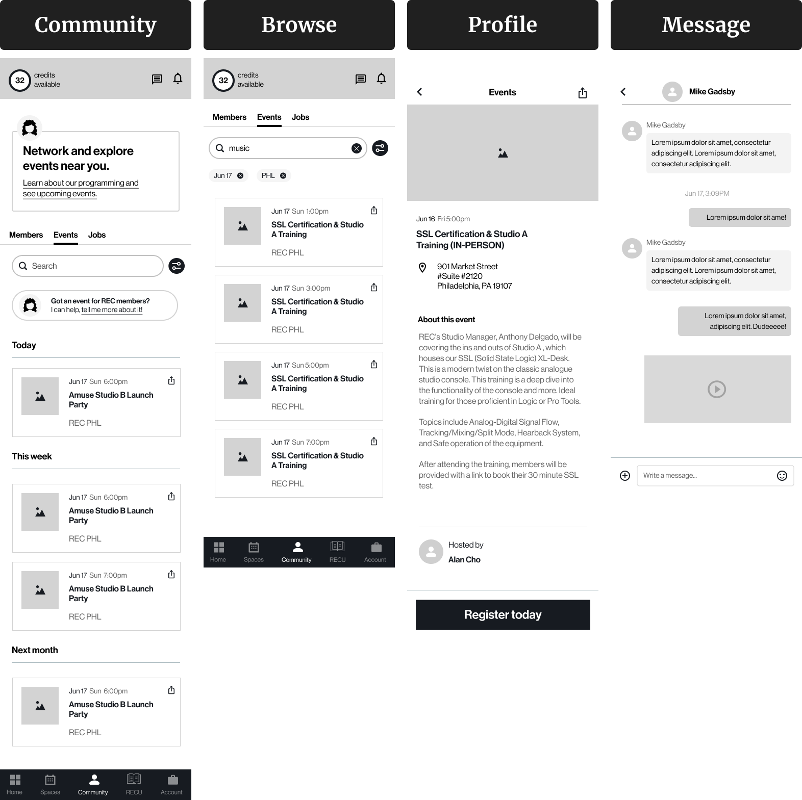
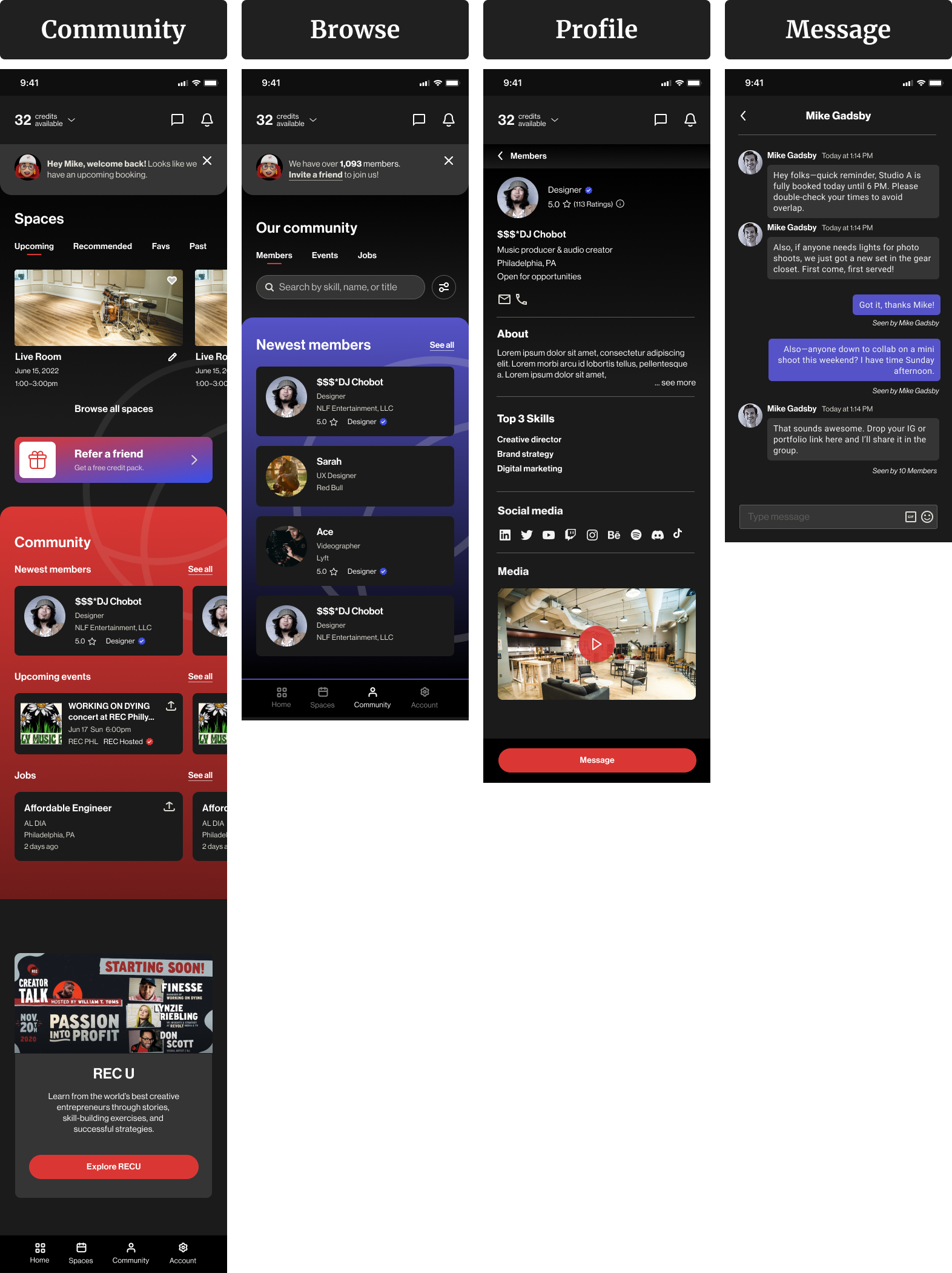
Members wanted more ways to connect and collaborate. I created a flow that made it easy to browse member profiles, explore jobs, and reach out to others.
- View community members by type or interest
- Browse events or job listings
- Tap into a profile for more details
- Message or connect directly in-app
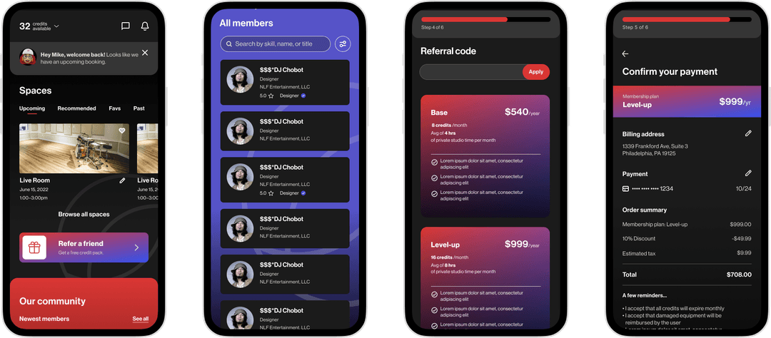
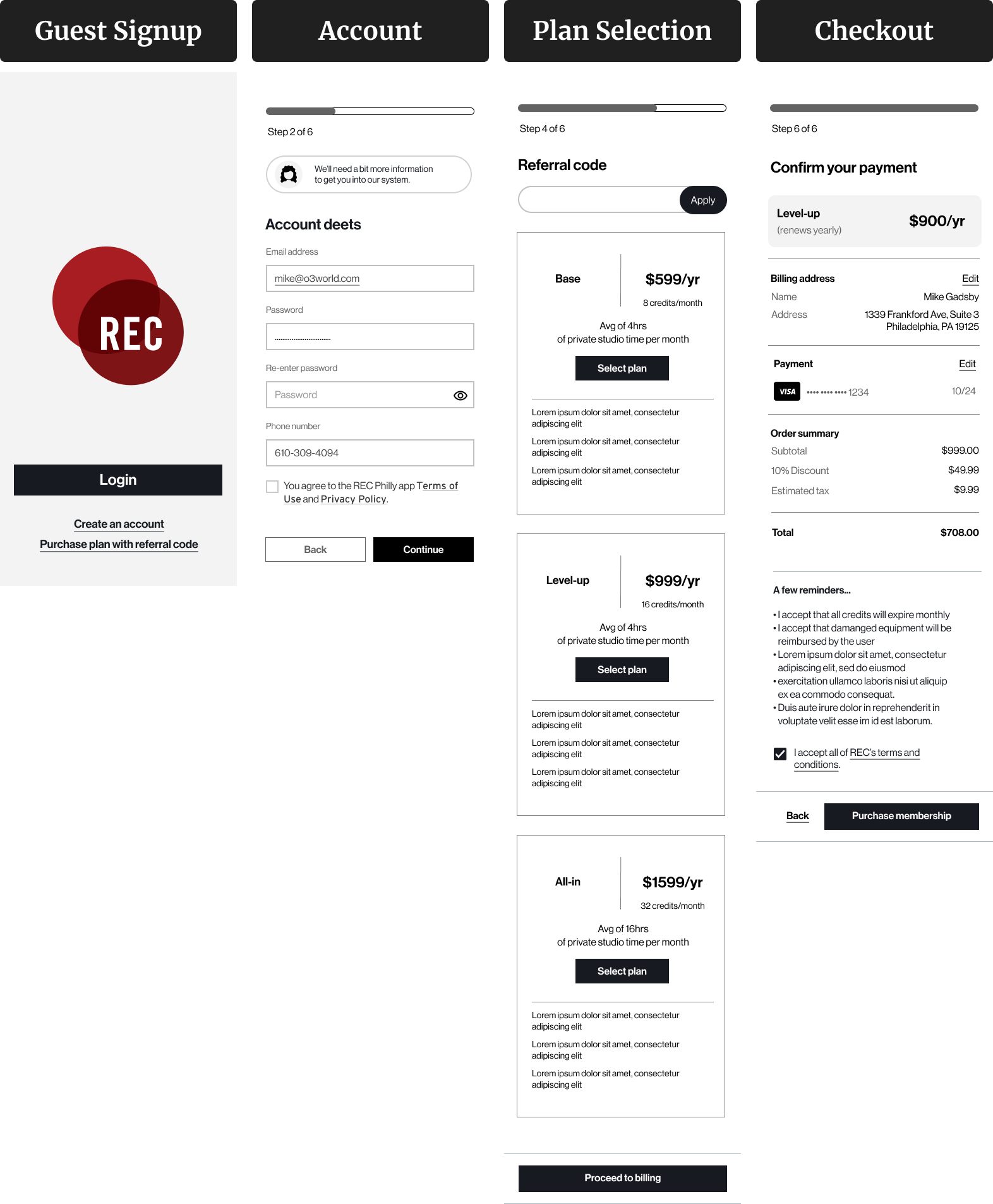
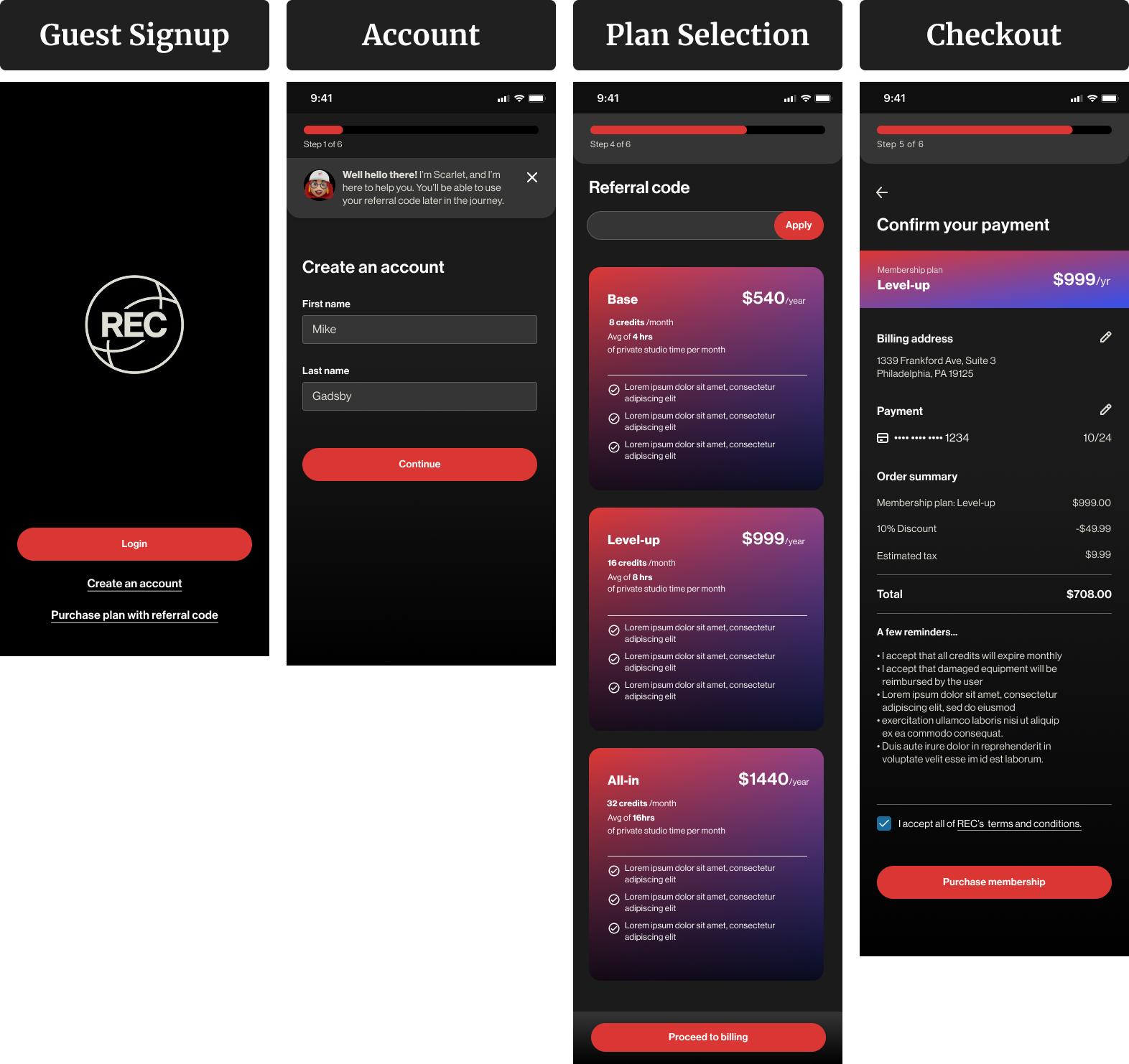
Guests could explore the app, but full access required a membership. I designed this flow to clearly explain benefits, offer different plans, and guide users through onboarding.
- Create account as guest
- See membership tiers and benefits
- Choose a plan
- Upgrade and complete payment
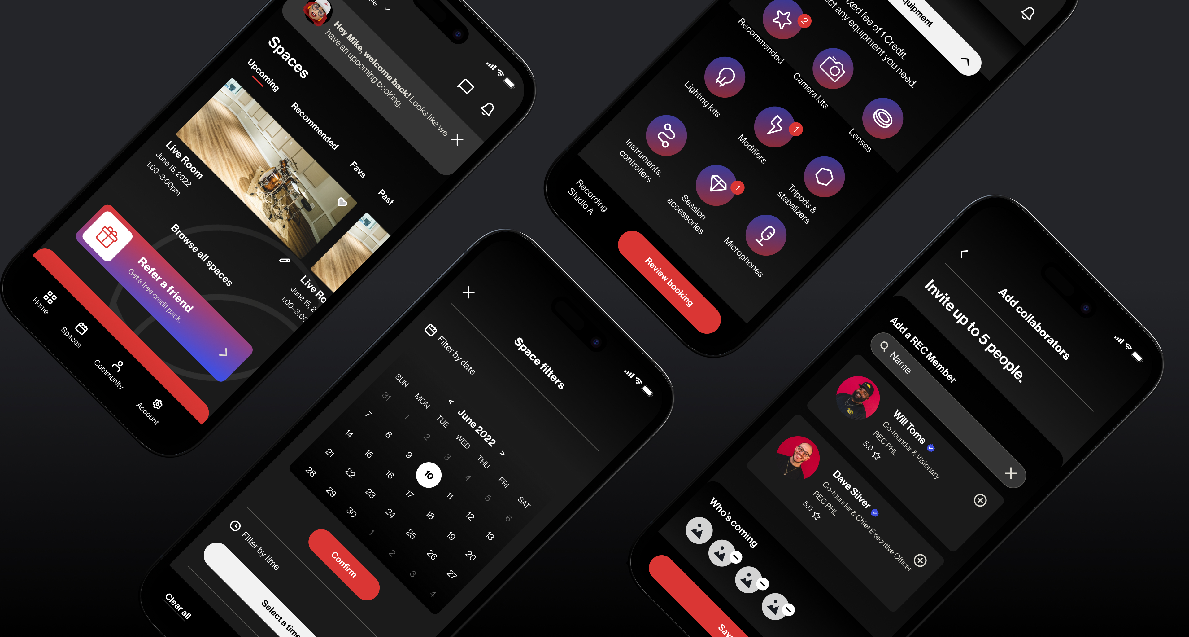
Wireframes
Before jumping into high-fidelity design, I created wireframes to define layout, content structure, and flow logic. These helped me quickly test ideas and collaborate with the team before polishing the UI.
I designed this flow to minimize friction. Key elements include space filters, availability preview, time slot selection, and booking confirmation.
The goal here was to help creatives find each other by interest, skill, or availability. I focused on profile cards, search filters, and connection actions.
This onboarding path was designed for first-time users — either signing up as a guest or activating a membership with a referral.
Visual Design
The final UI brings REC's bold creative energy into a simple, mobile-first experience. I focused on clarity, ease of use, and consistency — especially across high-traffic screens like booking and membership.
Designed for speed and clarity. Users can filter spaces, see live availability, and book in just a few taps.
Helps creatives discover and connect with each other. Clean layout, visual hierarchy, and simple actions.
Turn guests into members with a smooth plan comparison and payment flow.
Prototyping & Feedback
I built an interactive high-fidelity prototype focused on three core user flows: booking a room, exploring the community, and purchasing a membership. Rather than remote feedback alone, I visited REC in person to observe how the space actually operated.
I met with Scarlett, the front desk coordinator who handled all bookings manually, to walk through the prototype in context — watching where it fit naturally into her workflow and where it created friction. This on-site session shaped several decisions that a survey or remote test would have missed.
- The self-serve booking flow was easy to follow and removed a huge burden from the front desk
- The visual clarity of room availability helped avoid overlap and confusion
- Scarlett's friendly interaction style inspired the idea of the "Scarlett Chatbot," giving the app a warm, familiar tone
Outcome
Before this app, every booking for a 1,000-member community ran through a single coordinator. The design removes that bottleneck entirely — members can check availability, book, and pay without any staff involvement.
Testing with Scarlett produced two specific design changes: clearer time slot visibility (a friction point she caught immediately in walkthrough), and the Scarlett chatbot — modeled on her communication style — so the app retained the warmth members expected from interacting with her in person.
The designs were reviewed and accepted by the REC Philly team and handed off for development.
Takeaways
- Client meetings are most effective with a clear agenda and goal alignment. I learned to structure conversations to stay focused, prioritize key decisions, and make the most of everyone's time.
- Visiting the client's space made a huge difference. Observing Scarlett, the front desk coordinator, helped us understand the real challenges and rhythms of day-to-day bookings.
- That moment inspired a feature. Scarlett's warmth and helpfulness became the foundation for our in-app chatbot — designed to feel familiar, friendly, and human, just like she is in real life.
Like what you see?
Get in touch →