Granny Square Chart Tool
Visit Site →A crochet tool that translates written patterns into editable visual charts.
This started as a simple idea: take a written crochet pattern and turn it into a visual chart. It wasn't simple.
I'm a designer without a traditional engineering background, and this was my first time building a product end to end with AI. What I learned in the process changed how I think about both design and building.
Crochet pattern publishing is a real market — designers sell patterns on platforms like Ravelry, Etsy, and their own sites. Charts are the preferred format for buyers: clearer, faster to read, and usable across languages. But creating charts manually is time-consuming, so many designers publish text-only and leave chart-format revenue on the table.
This tool targets that gap: reduce the cost of producing a chart, so designers can offer a format their customers prefer without the manual overhead. I'm currently testing with early users to validate willingness to pay.
Granny squares are one of crochet's most expressive formats. Their shapes, colors, and construction often aren't fully understood until they've actually been made. If you want to design one, you traditionally have to crochet it first to see the result.
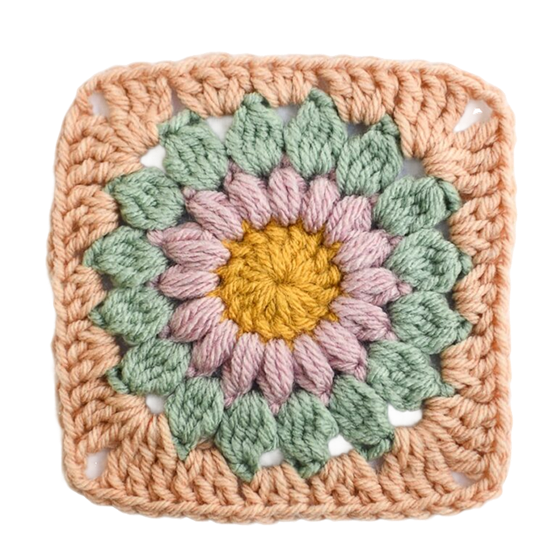
Granny square example — also called a Sunburst Granny Square
My first instinct was to use AI to generate visuals directly from a text prompt. I tested that assumption by talking to experienced crocheters — and quickly learned it wouldn't work. Crochet construction is structural: stitch placement depends on sequence and how the piece is physically worked, not just what it looks like.
Those conversations also surfaced the real gap: pattern designers know charts are clearer and easier to understand across languages, but creating them manually takes time — so many skip it and publish text-only. Users strongly prefer charts. That mismatch is the problem this tool is designed to close.
Sunburst Granny Square
- Magic Ring
- Rnd 1: 16 dc [16]
- Rnd 2: (puff, ch 1) repeat 16 times [32]
- Rnd 3: (cl, ch 2) repeat 16 times in ch-sp [48]
- Rnd 4: ((3 tr, 3 ch, 3 tr) in corner-sp, 3 dc in ch-sp, 3 hdc in ch-sp, 3 dc in ch-sp) repeat 4 times [60]
Sunburst Granny Square
Why it was harder than it looked
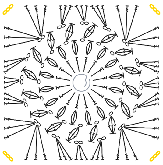
A crochet chart isn't just icons arranged on a canvas. Stitch placement depends on structure, sequence, and how the piece is actually worked. A result can look visually correct while still being structurally wrong.
Square and circular patterns also follow different construction logic, so one generic placement model couldn't cover both. What sounded like a simple translation problem turned out to be a systems design challenge.
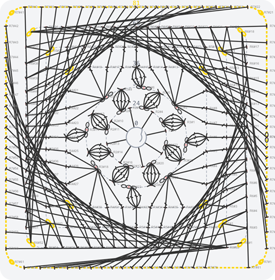
I started by jumping in, building quickly in Cursor. For a while, it seemed to work. Then the charts started breaking, and no matter how I adjusted my prompts, the output kept getting messier. I couldn't prompt my way out of it.
Early broken output
Improved output
The failure wasn't a bug I could patch. It pointed to a fundamental design decision I had been deferring: what should a stitch actually be in this system?
I also defined a set of common failure cases and used them as consistent checkpoints throughout testing, rather than relying on prompting alone to catch mistakes.
Common pitfall
Key design decisions
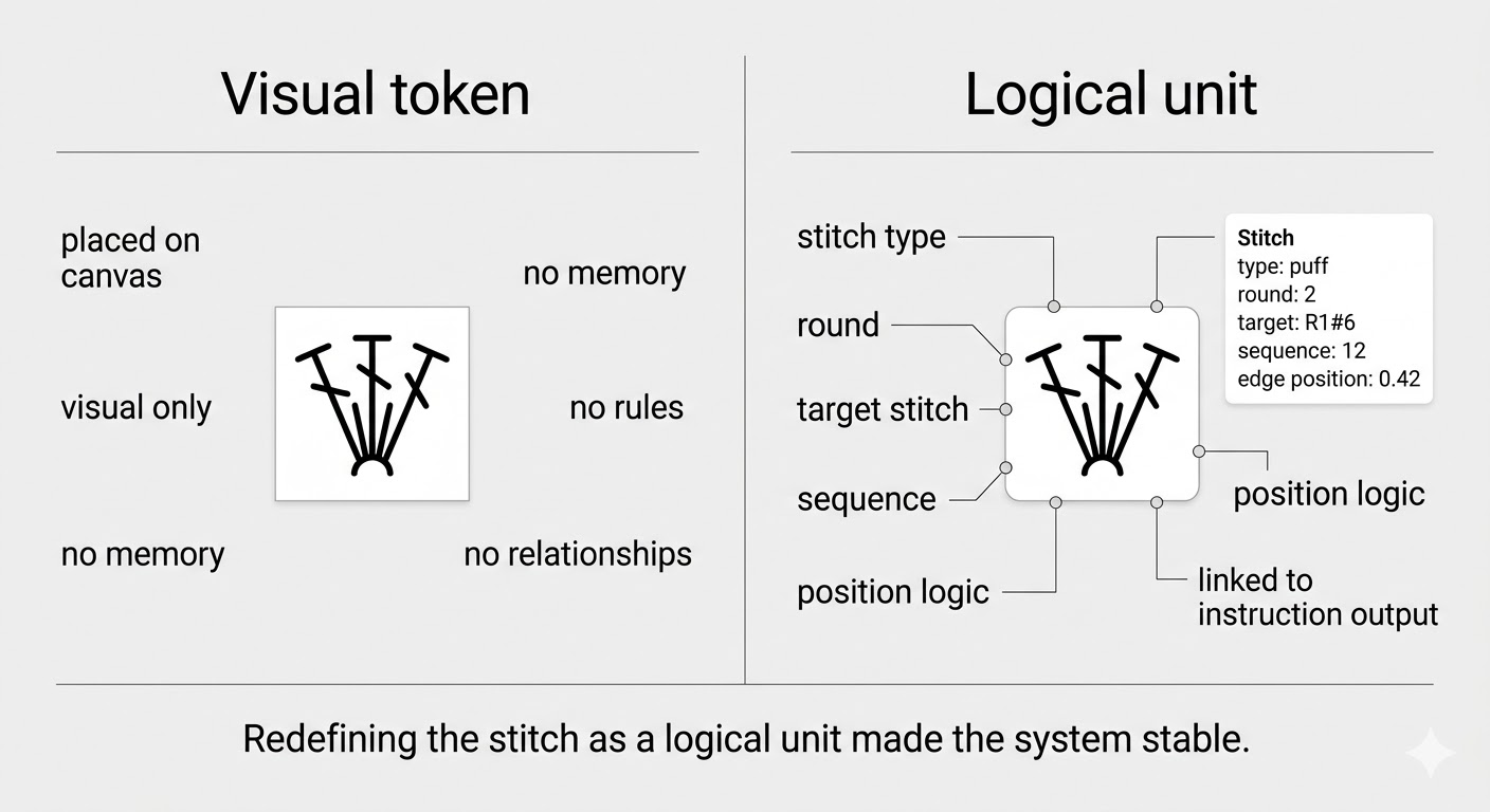
The first approach treated each stitch as a visual token — an icon placed on a canvas. It was fast to build and looked right immediately.
The problem: a visual token has no memory, no rules, no relationships. It doesn't know what stitch comes before it, what round it belongs to, or how the pattern is constructed. Any logic I built on top of it had nothing stable to hold onto — which is why the charts kept breaking when I tried to add editing or export.
I stopped building and made the harder choice: define the stitch as a logical unit with structure, placement rules, and relationships baked in. The visual layer would become a derived output from that structure — not the source of truth itself. This meant rebuilding the data model entirely, but it was the only approach where the system could scale.
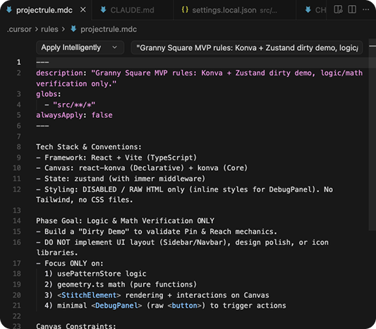
Project rule
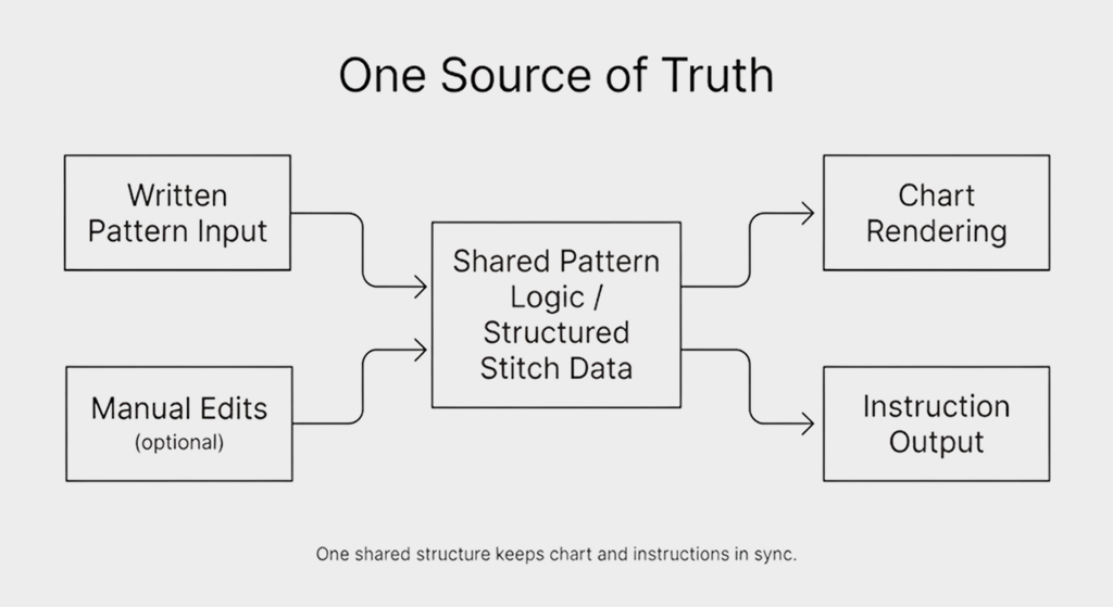
I wanted users to be able to adjust the output and still trust the result. That meant chart and instructions had to stay in sync no matter what changed.
So I kept one source of truth for both chart rendering and instruction output. Edits in one place stayed reflected in the other, and the two never drifted apart.
Outcome
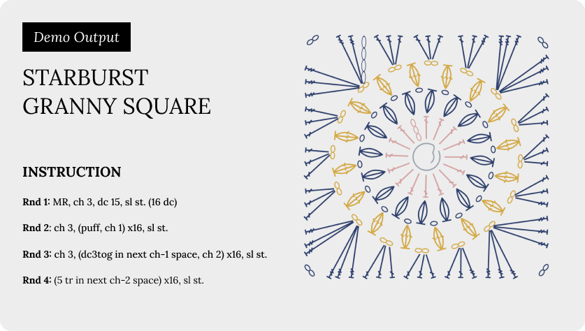
The app supports a complete workflow: written pattern in, visual chart generated, instruction output synced. Users can adjust the chart manually, and the instructions update accordingly.
I tested the flow myself and gathered early feedback. The core loop works, and the structural approach holds up across different pattern types. Built solo, in one month.
- Niche creative workflows look simple on the surface. They rarely are.
- The real design work was deciding what the system should treat as true, how much control users needed, and how to make the result reliable enough to trust.
- AI accelerates execution. It doesn't replace domain understanding or clear system logic.
- As a designer, learning to think in structures — not just visuals — was the shift that made everything else possible.